United States of Alcohol, A Colorful Map That Plots What Americans Generally Like to Drink by Region
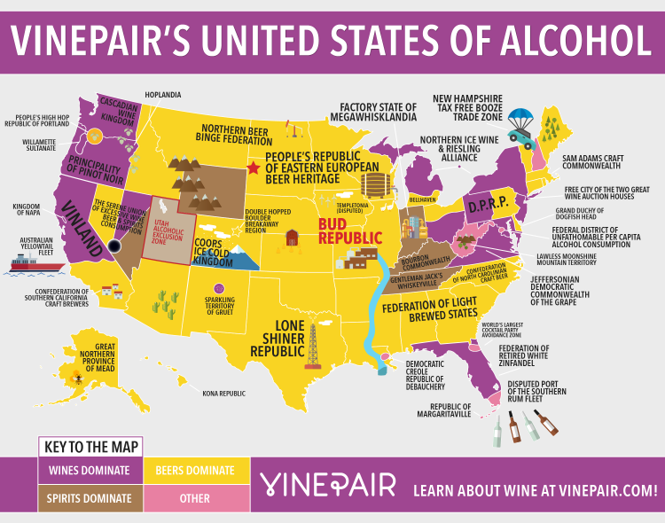
VinePair (previously) has created “The United States of Alcohol”, a colorful map that plots what Americans generally like to drink by the region in which they live, noting that each geographical area has its own opinion much in the same way of politics.
As has often been said before, what makes the United States so interesting and incredible is that while we’re one unified country, when you really boil us down, we’re also a nation of several smaller countries, with different tastes, attitudes and opinions. While we often break down the country in terms of our politics, the same can happen when you look at what we like to drink. Here’s what a map of our country might look like if our drinking preferences were what divided us, instead of politics.

