Designer Reimagines a More Detailed New York City Subway Map In an Elegantly Readable Style
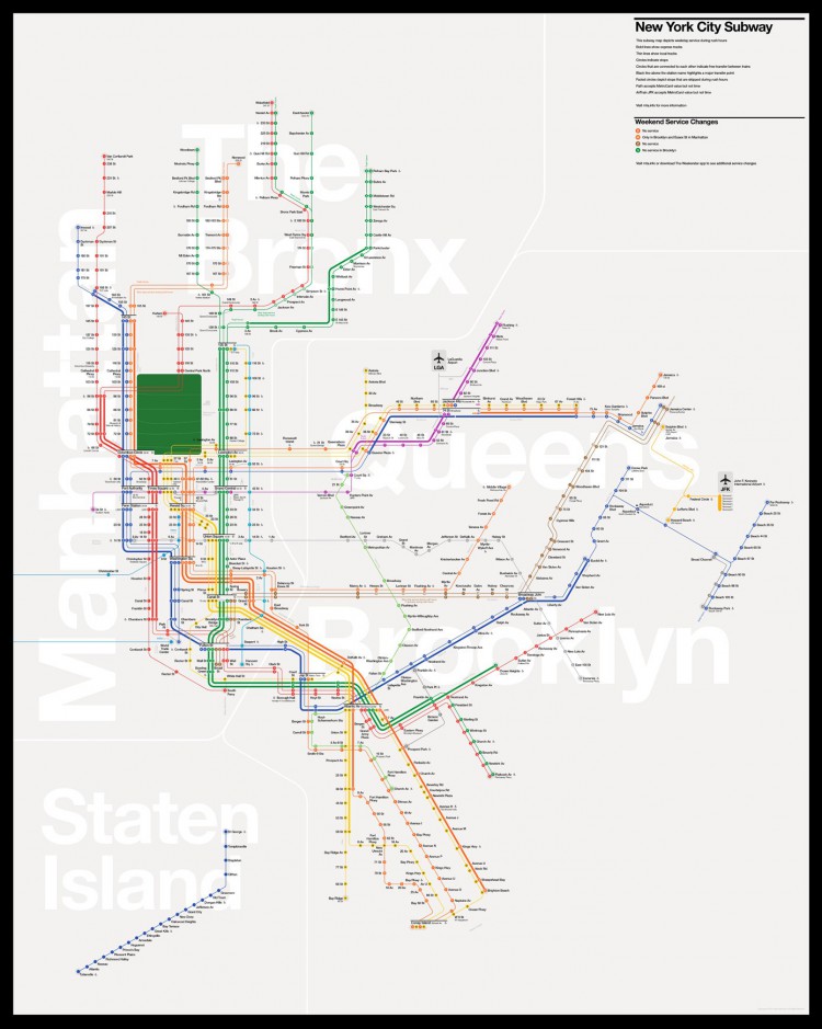
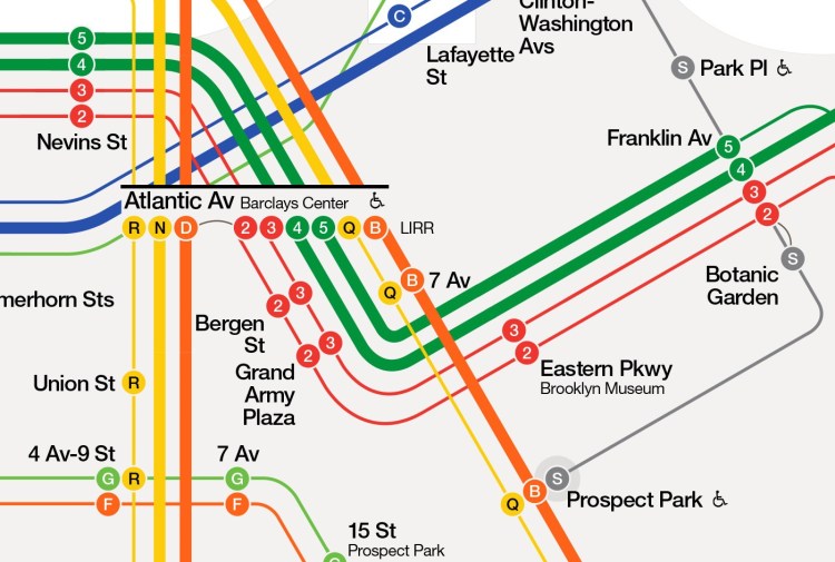
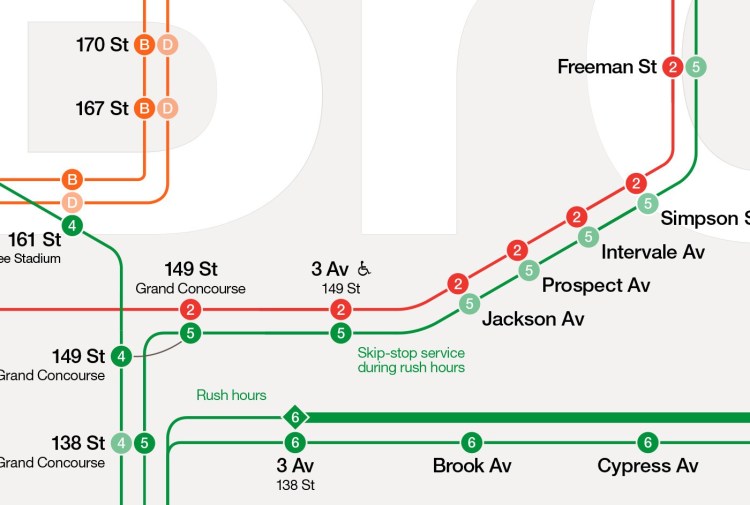
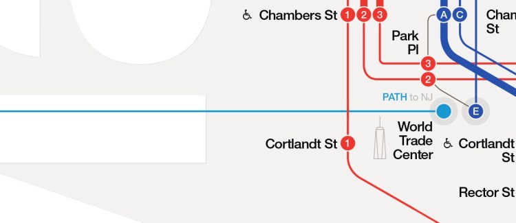
Designer Tommi Moilanen has created an elegant redesign of the New York City subway map, which seeks to provide more detailed information about trains, landmarks and transfers – things that aren’t as easily recognized on the map that is currently employed throughout the city.
Instead of showing lots of geographical details the map highlight sights, major landmarks and museums. Those are useful navigational aids to many people. Streets are more specific to where you happen to be heading at any given time and most of them are useless most of the time but people can be counted on to know at least some of the major landmarks.. …Subway/metro maps should always look like they belong to the specific city they were designed for and to that specific city only. Design is always context specific and as shown above, New York City, like any other city for that matter, has its own specific features and character that should be reflected in the design.
images via Tommi Moilanen
via Coudal Partners

