image via Shifting Cities
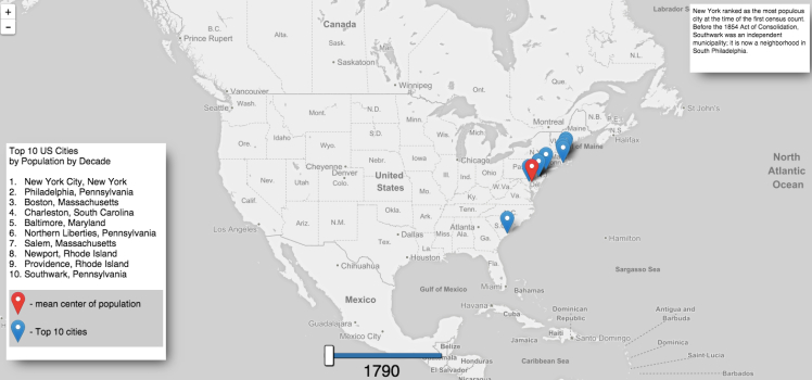
Online map developer Keir Clarke has created Shifting Cities, an interactive map that plots the ten most populous cities in the United States over the course of 220 years, starting with the year 1790 and concluding in the year 2010. Clarke was inspired by a gif he saw on reddit in which he immediately noticed a westward population trend throughout the years.
Since the early years of the United States there has been a gradual westward shift in the mean center of population. In 1790 the most populated cities in the U.S. were all on the East Coast. In the 2010 census seven of the ten largest cities were located in the Sun Belt region of the south and west. …A few weeks ago I saw a really interesting animated GIF, posted to Reddit, which mapped the top ten cities by population by decade in the United States. …Being an animated GIF means that you can’t interact with the map. I really wanted to play with the map so I decided to create my own interactive map of the same data.
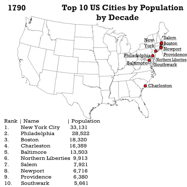
The gif that inspired Clarke.
via Neatorama