New York Times Quiz Uses Idiomatic Phrases to Plot Linguistic Differences of Spoken English on Map
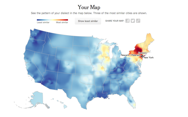
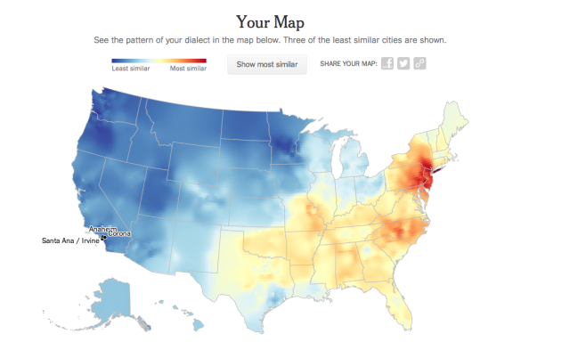
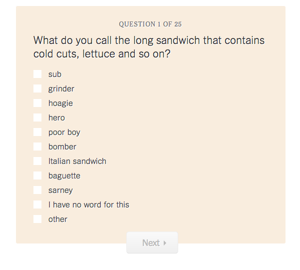
The New York Times posted a 25 question quiz using idiomatic phrases and regional dialects to detect linguistic differences in spoken English and plotted the information on a map where similar phrases are spoken. The quiz was based upon the Harvard Dialect Study, a linguistics project begun in 2002 by Bert Vaux and Scott Golder.
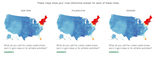
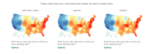
The data for the quiz and maps shown here come from over 350,000 survey responses collected from August to October 2013 by Josh Katz, a graphics editor for the New York Times who developed this quiz. The colors on the large heat map correspond to the probability that a randomly selected person in that location would respond to a randomly selected survey question the same way that you did. The three smaller maps show which answer most contributed to those cities being named the most (or least) similar to you.
images via The New York Times

