Why Companies Are Simplifying Their Distinctive Logos
Bloomberg columnist Ben Schott talks about why popular brands are simplifying or “debranding” their distinctive logos that have come to symbolize a company’s identity.
In recent years, some of the world’s biggest companies have discarded depth and detail to “debrand”. But what prompted this landslide of logo debranding?
Schott further explains that these changes are taking place due to the need for designs that work well on mobile devices, reducing “visual excess” as just about anyone can make changes to an image at any time.
Anyone who has over-filtered an Instagram sunset knows the seductive lure of visual excess, and it’s a seduction to which the pros are not immune. The ability to round corners, drop shadows, customize gradients, and create complex lighting effects can easily overpower the creative brief and often does
He also cites brand maturity, noting that early startups create more complicated logos that are scaled down as the company grows more financially stable.
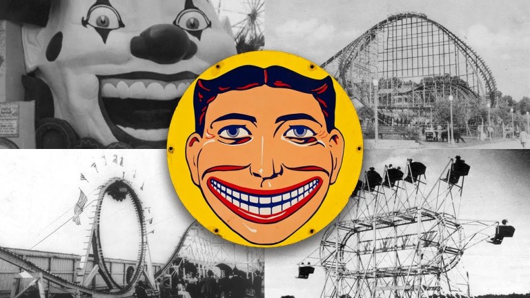
Also, the question of maturity. Many of our biggest brands were born in a spirit of playful innocence that burst forth from their early branding…as these companies grew and the stakes rose, so their logos were obliged to mature from cartoonish to corporate, flamboyant to flat, wacky to bland, illustrating the power of de-branding to professionalize.
Other reasons for debranding includes fashion and an update to what the company offers.
Company graphics are as susceptible to trends as any other design as we see in the stampede of fashion’s little black dress logos…. yet the most intriguing element of the debranded logo is its potential to become a portal
via Boing Boing