An Interactive Chart That Roughly Plots the Amount of Years Left In a Person’s Life
Flowing Data has put together an interactive chart that roughly predicts the probable number of years remaining in a person’s life, solely utilizing the person’s gender and age.
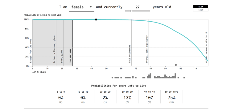
The graphic uses data from the Social Security Administration to simulate your possible lifetimes. That’s plural. The line shows the probability you live to see your next birthday, given age and sex. Each running dot represents a possibility. As expected, the probability that you live to the next year decreases as you age. More than 99% of people under the age of 60 live to see the next year, but the probability shifts towards zero relatively quickly after that. Let the simulation run long enough (or flip on the “fast” switch), and the distribution always converges towards a curve that skews towards older. That’s expected. The individual data points? Those are much less predictable. Well, depending on your age of course.
image via Flowing Data