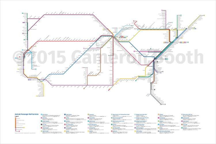
An Updated Map Showing National Amtrak Routes and Stations as a Subway Map
Designer Cameron Booth (previously) has released a newly updated map that shows national Amtrak routes and stations as a subway map. Booth originally created the map back in 2010, and he has maintained it by adding or deleting stations since that time.
In a post on his site, Booth says he felt it was time for a significant update to the map because, at the end of April 2015, Amtrak will be discontinuing its Hoosier State service between Indianapolis and Chicago. Booth also made significant changes to the design on several different levels, and writes about the changes in detail in the blog post.
One thing that had begun to bother me about the previous version was the sheer amount of routes that had to be shown along the Northeast Corridor. There are eleven separate services heading south out of New York Penn Station, and showing them all side by side both took up a lot of space and made the stopping patterns of those services difficult to discern. I hit upon the idea of overlaying services that had identical stopping patterns on top of each other, using multiplied transparency effects to layer the colours up on top of each other.
image via Cameron Booth
via Coudal


