GOOD Infographic on the History of the US Economy
Nigel Holmes created an cool infographic for GOOD on the history of the US economy.
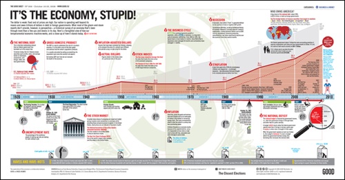
What most of the doom-and-gloom reports on our economy don’t provide is perspective—a historical survey of an economy that’s been through more than a few ups and downs in its day. Here’s a farsighted view of how our temperamental economic machine works, and a close-up of how it stands today.
graphic by Nigel Holmes for GOOD