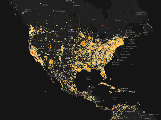
The Internet Archive recently released an interactive map that visualizes mentions of place names by American TV news programs over the past four years. The map can be viewed as a static or animated heat map—the animated version visualizes the shifting geographic focus of the news over time. Researcher Kalev Leetaru based the visualization on closed captioning data from the Archive’s TV News research service. For more on the visualization, see this Internet Archive blog post.
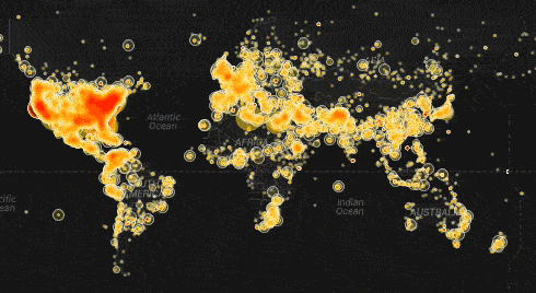
images via Internet Archive