A Pair of Maps Demonstrating the True Geographical Size of the African Continent
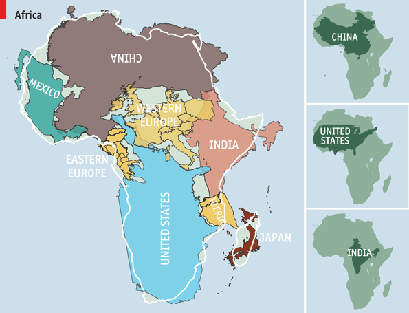
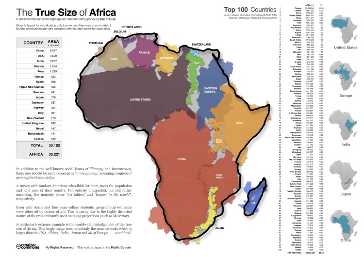
German software designer Kai Krause created a map demonstrating the true geographical size of Africa in 2010 by fitting a number of other countries — including the United States, China, and most of Europe — into the outline of the continent. The Economist followed suit by creating a slightly reworked version of the concept, using different data points, but both examples drive home the same point: Africa is much, much larger than it appears on most maps. This is due to a sort of distortion that occurs when creating a two-dimensional map from the global sphere.
images via The Economist, The Mary Sue
via The Economist


