A Map Comparing the Use of ‘Um’ Versus ‘Uh’ in the United States
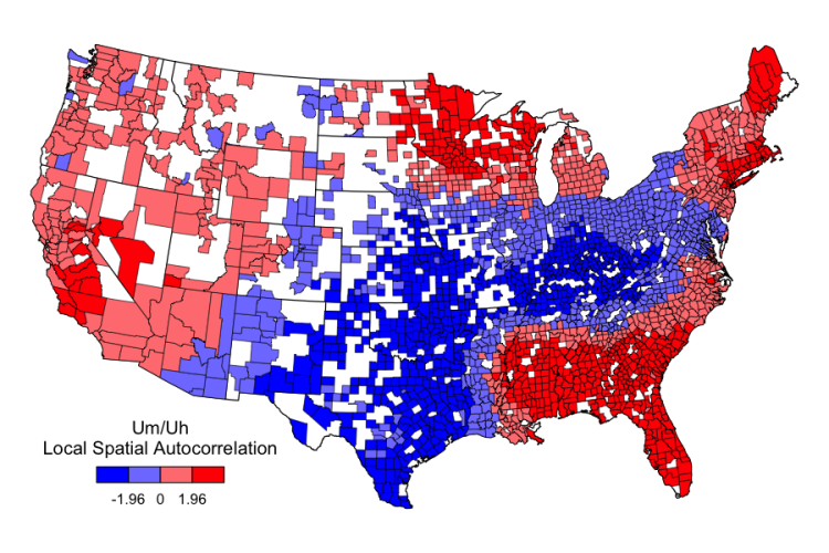
Dr. Jack Grieve of Aston University has created a map comparing the use of “um” versus “uh” in the United States. Grieve used “a few billion” words from geocoded 2013 tweets on Twitter to create the map after a conversation with Mark Liberman of Language Log. Red is for “uh” and blue is for “um.”
Attached is a locally autocorrelated map based on the percent of um vs uh (i.e. um/(um+uh)) in a few billion word of geocoded tweets of 2013 (about 40,000 tokens each). Red are areas where “uh” is relatively more common and blue are areas where “um” is more common. quite a clear pattern, and probably the clearest Midland (only?) lexical pattern I’ve ever found.
image via Language Log
via Coudal Partners

