Isoscope, An Interactive Tool Exploring the Mobility of Traffic
Isoscope is an interactive tool by Flavio Gortana, Sebastian Kaim, and Martin von Lupin that visualizes which locations are reachable by car or pedestrian traffic from a chosen location in a given time using data from the HERE API. Each hour of the day is represented by a layered shape that showcases how far one could travel from the designated point in the given amount of time. The tool was created as part of a course at the University of Applied Sciences in Potsdam, Germany.
We drive to the closest supermarket, take the bike to the gym or walk to the cafe next door for a nice chat among friends. Getting around — thus mobility — is an essential part of our being. We were especially intrigued by those situations when our mobility is compromised such as in traffic jams or during tough driving conditions. How do those restrictions impact our journeys through the city and who is affected most? Obviously, a car can hardly bypass a traffic jam, whereas a bike is more flexible to continue its journey. Let alone the pedestrian who can stroll wherever he wants to. Isoscope tries to answer the questions above by comparing different means of transport and their sensitivity for disturbances.
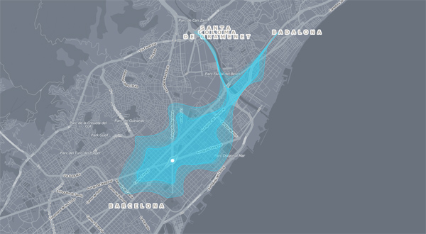
Barcelona, Plaça de les Glòries Catalanes | 6 minutes
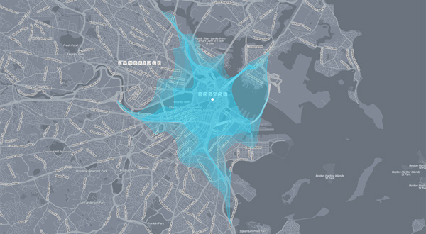
Boston, Boston Common | 10 minutes
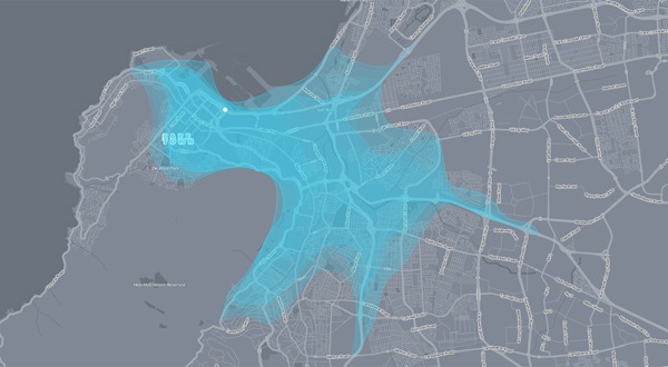
Cape Town, Foreshore | 10 minutes
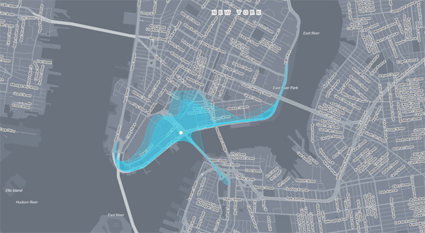
New York, Brooklyn Bridge | 4 minutes
images via Martin von Lupin
via FlowingData

