What Popular Brands Would Look Like if Their Color Schemes Were Swapped With Competitors
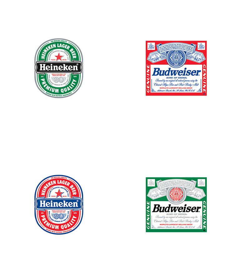
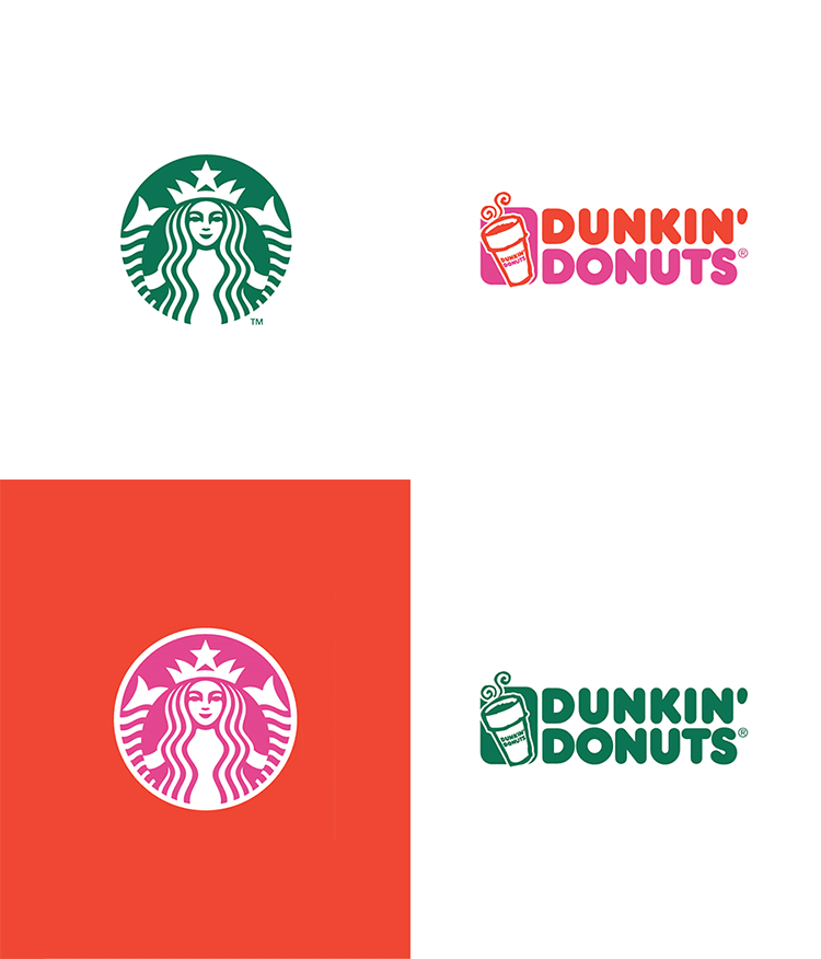
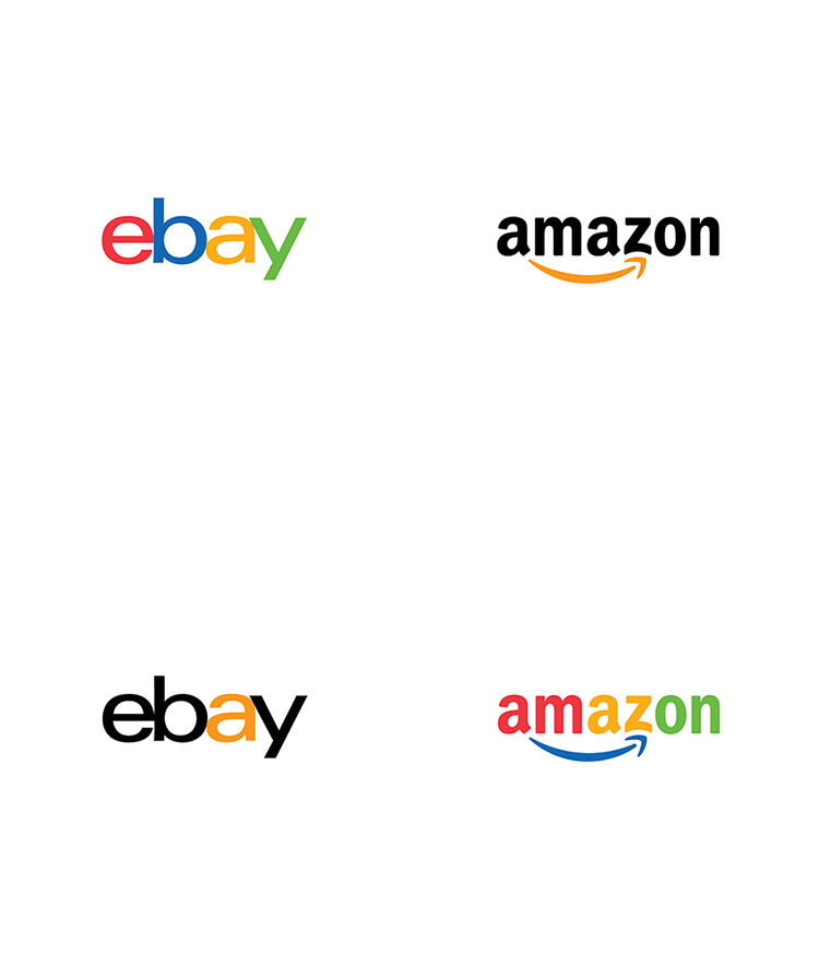
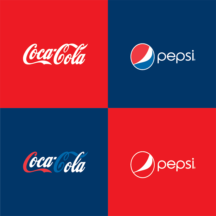
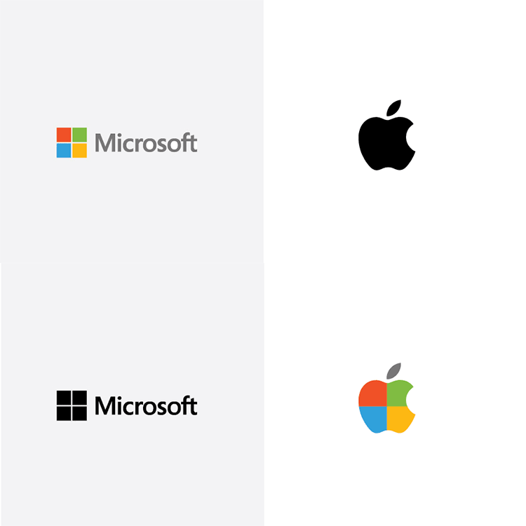
Paula Rúpolo, chief designer at Printsome, has swapped the color schemes (part one and part two) of popular brands with their competitors. The outcome of her design project is quite eye opening. The colors depicting each company are very powerful and what make them so recognizable to the public. The full “Brand Color Swap” series is available to view on the Printsome Blog.
Color is probably the most important part of branding. It walks side by side and hand in hand with the brand’s visual identity, is there from the very first minute and, if it’s chosen correctly, stays for eternity. Would you get eager for french fries without McDonald’s giant yellow M? Or would Coca-Cola be the same without its magnetic red? We can’t know for sure. Coke doesn’t even have an exact Pantone matching color anymore (though they recommend 485, apparently), making it almost mythical. Respect.
If you went to design school, one of the first things you’ll have learned is: colors represent emotions. Blue means calm and trust, green means vibrancy and draws eco friendly connotations, red means passion or danger and will make you want to leave a restaurant quickly if it’s plastered on the walls. Or something like that; ‘urgency is red’, they say. Luckily or not, I had a couple of professors of semantics who were very keen about it back in my BA, they made me never forget about the obvious: everything means something, always. (read more)
images via Printsome
via DesignTAXI
