An Animated Map Visualizing the Enormous Population Growth of the United States Between 1790 and 2010
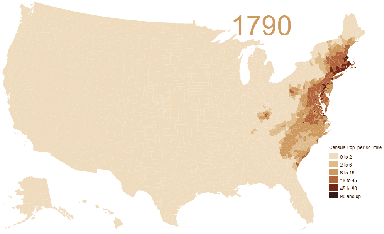
A really informative animated map was created to show the enormous population growth spurt of the United States between the years 1790 and 2010. This fascinating map was made with census information from geographically standardized tables by NHGIS employee Jonathan Schroeder.
This map shows how the population moved almost exclusively westward during the nascent years of the country, fulfilling their “Manifest Destiny”. With the Louisiana Purchase in 1803, people began to move southward and the California Gold Rush filled in some the West coast.
There were also some land anomalies and government errors. Jeff Desjardins of Visual Capitalist explains that much of the land in Oklahoma was thought to be land reserved for Native American resettlement, but the land rushes of 1889 nullified that agreement.
the area around modern-day Oklahoma is colored in, but the state itself is an “empty gap” on the map. The reason for this? The area was originally designated as Indian Territory – land reserved for the forced resettlement of Native Americans. However, in 1889, the land was opened up to a massive land rush, and approximately 50,000 pioneers lined up to grab a piece of the two million acres (8,000 km²) opened for settlement.
Vivid Maps also broke out the density numbers per square mile.
Residents per square mile
1800 – 6.1
1850 – 7.9
1900 – 21.5
1950 – 42.6
2000 – 79.6
2017 – 92.2