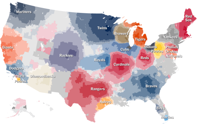
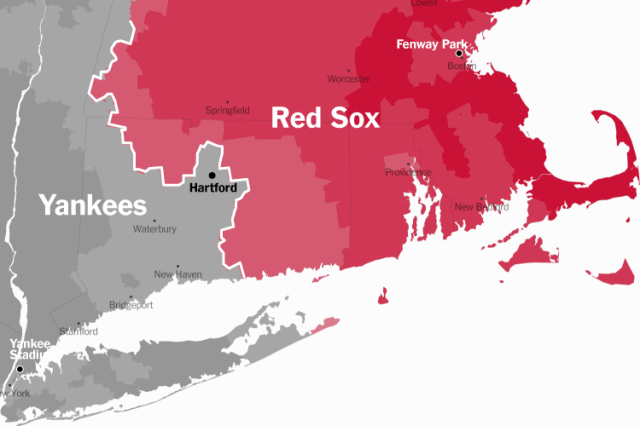
A Series of Interactive Maps Showing Preferred Major League Baseball Teams by Region Across the United States
The Upshot over at The New York Times has used aggregated data provided by Facebook to create a fascinating series of 14 intricately detailed, interactive maps showing preferred Major League Baseball teams by region across the United States. The 14 maps, with detailed analysis accompanying each, are available over at The Upshot.
images via The New York Times The Upshot


