World Map Visualizing Friendships on Facebook
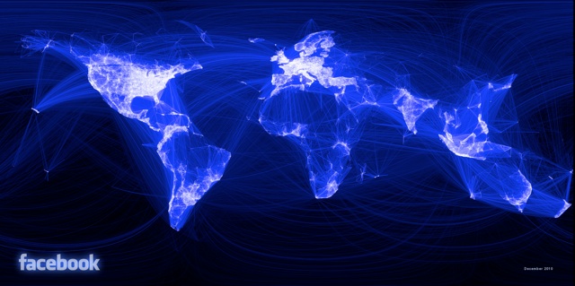
Paul Butler, an enginnering intern at Facebook, created a really cool world map visualizing friendships on Facebook.
When the data is the social graph of 500 million people, there are a lot of lenses through which you can view it. One that piqued my curiosity was the locality of friendship. I was interested in seeing how geography and political borders affected where people lived relative to their friends. I wanted a visualization that would show which cities had a lot of friendships between them.