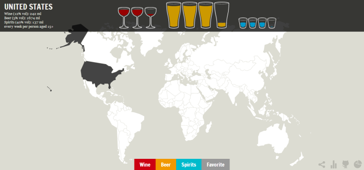
Self-described digital craftsman Piero Ciarfaglia (known also as zenoid) has created a map detailing the world’s alcoholic consumption and preferences by country. The map was compiled for data visualization site Ghost in the Data using alcohol and health data from the World Health Organization. The maps breaks the data down into Wine, Beer, and Spirits, and gives average numbers for consumption every week as well as a visualization of how many drinks it represents.
via Vox