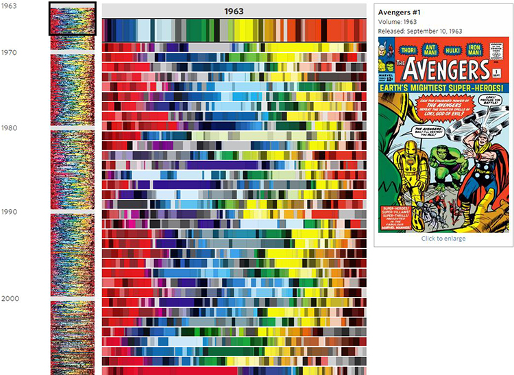
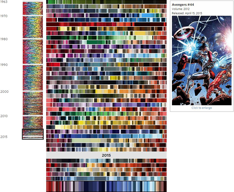
An Analysis of the Shift in Color Palettes Used in More Than 50 Years of ‘Avengers’ Comic Book Covers
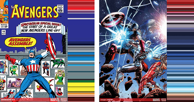
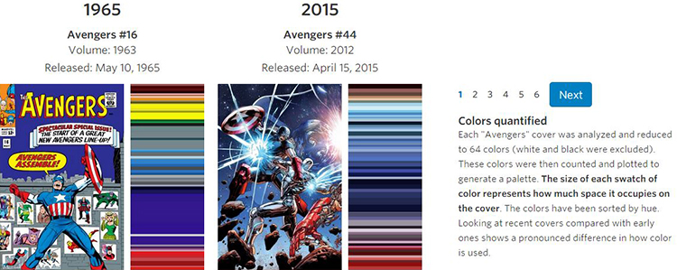
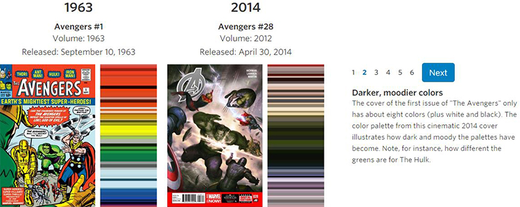
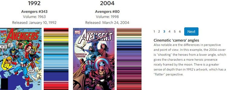
The Wall Street Journal has published an in-depth article and interactive graphic that analyzes the shift in color palettes used in more than 50 years of Avengers comic book covers. All of the color palettes they generated and more information about the shift in colors is available to view online.
When Marvel’s “Avengers: Age of Ultron” opens in theaters next month, a familiar set of iconic colors will be splashed across movie screens world-wide: The gamma ray-induced green of the Hulk, Iron Man’s red and gold armor, and Captain America’s red, white and blue uniform.
How the Avengers look today differs significantly from their appearance in classic comic-book versions, thanks to advancements in technology and a shift to a more cinematic aesthetic. As Marvel’s characters started to appear in big-budget superhero films such as “X-Men” in 2000, the darker, muted colors of the movies began to creep into the look of the comics. (read more)
images via The Wall Street Journal
submitted via Laughing Squid Tips

