A Wonderfully Legible Redesign of a Parking Sign
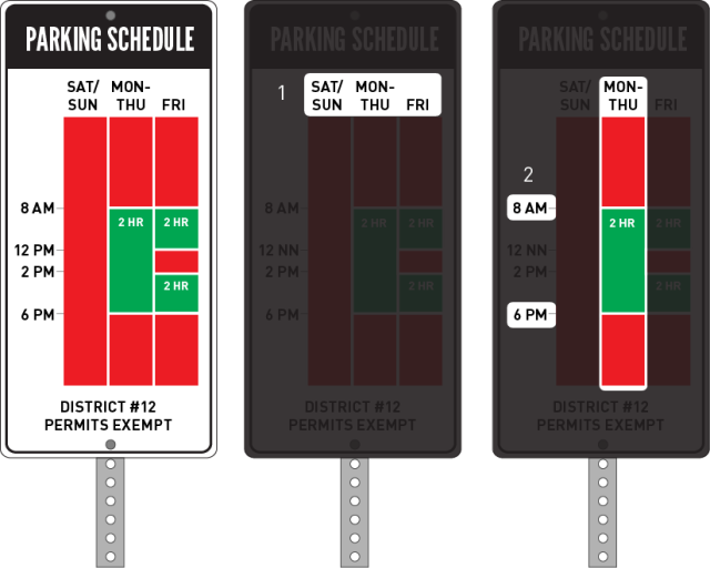
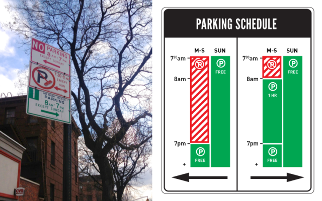
New York City-based designer Nikki Sylianteng has come up with a simple redesign of quite possibly the most confusing type of street sign: The parking sign. Her simplified sign features a graphical representation of no-parking and free-parking hours, rather than the typical jumble of text, times, and exceptions. She’s testing prototypes of the sign as part of her design and urban intervention project, To Park or Not to Park.


