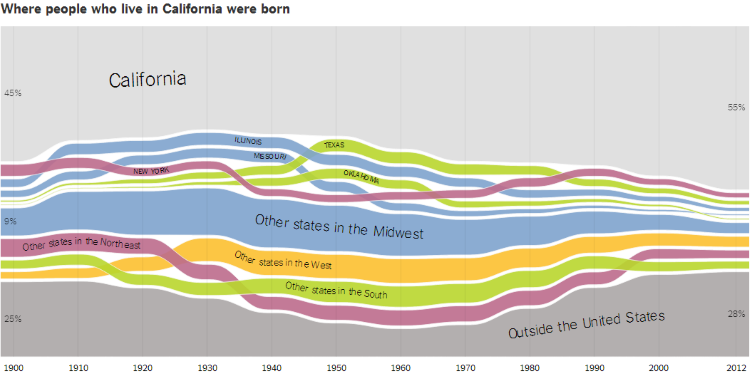
A Series of Interactive Charts Detailing Migration Within the United States by State
The Upshot over at The New York Times has posted a series of interactive charts detailing migration within the Unites States by state. The charts, which begin at 1900, were created using microdata from the United States Census Bureau gathered from the University of Minnesota’s Minnesota Population Center.


