An Interactive Infographic Showing the Global Migration of People Between 1990 and 2010

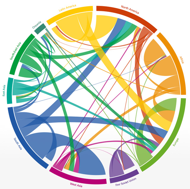
2005-2010. Image via Wittgenstein Centre
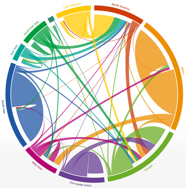
“The Global Flow of People” is a fascinating interactive infographic that visualizes human migration between world regions from 1990 to 2010. The visualization can be viewed in five year increments, which gives a sense of how population flows have changed in recent decades. The infographic was created by Nikola Sander, Guy J. Abel, and Ramon Bauer at the Wittgenstein Centre for Demography and Global Human Capital and was published back in March in Science magazine.

1990-1995. Image via Wittgenstein Centre
via Boing Boing


