Graphical Representation of Left vs. Right
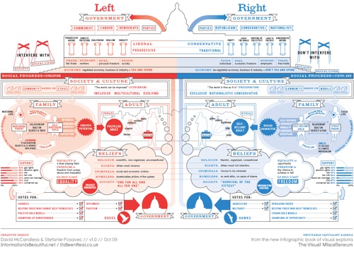
Information is Beautiful has created a beautiful infographic showing the political spectrum of the Left vs. Right. They made both a World version and US version.
Note: The graphic shown here is the “World” version where left = red & right = blue.