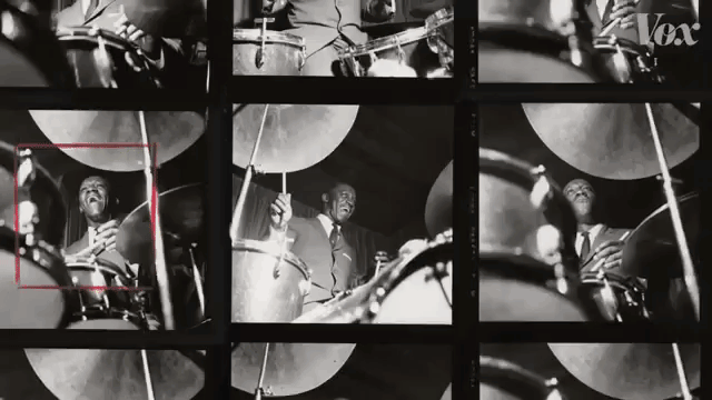
In the second chapter in her mini-series about American Jazz, video producer Estelle Caswell of the Vox series Earworm, explores the fascinating history of the specific design features most associated with jazz albums with the help of legendary archivist Michael Cuscuna.
This iconic style, which primarily consisted of strategically cropped session photos and the playful use of typography to visually describe the music, was developed by graphic designer Reid Miles of the legendary Blue Note Records. Throughout his career, Miles designed over 500 album covers, each one unique to the artist and absolutely spot on.
When asked to visualize what jazz looks like, you might picture bold typography, two tone photography, and minimal graphic design. If you did, you’re recalling the work of a jazz label that single-handedly defined the “look” of jazz music in the 1950s and1960s: Blue Note.

Jazz part 2 is a little visual palate cleanser. A deep dive into the world of @bluenoterecords album covers – your tour guide is the legendary Michael Cuscuna. https://t.co/XGSzrN8XaF
— Estelle Caswell (@estellecaswell) November 19, 2018
Here are some excellent examples of Miles’ iconic work and influence.