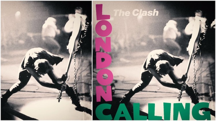
Music essayist Noah Lefevre of Polyphonic explains the circumstances that caused The Clash to use a photo of bassist Paul Simonon smashing his favorite Fender while backstage at The Palladium in New York City. A well-behaved crowd that was being further held back by bouncers was the source of Simonon’s anger, as the band was used to raucous interaction with their crowds.
This now-iconic picture was taken by photographer Pennie Smith in 1979. When the band was looking for artwork to grace their album cover, Joe Strummer found the photo and was absolutely taken in by its sheer emotion. The cover’s typography borrowed heavily from the debut album of Elvis Presley, as if to that say Rock and Punk were forged together as one.
The Clash finished off the album artwork with a perfect choice of typography. The typography idea came courtesy of illustrator Ray Lowry…created a logotype that paid homage to the typography of Elvis Presley’s debut album. The font perfectly framed Pennie Smith’s photo and it called back to the roots of punk rock. In a lot of ways, punk rock was born out of the 1950s Rockabilly tradition. Simple songs in a basic structure, driven by pure emotion.