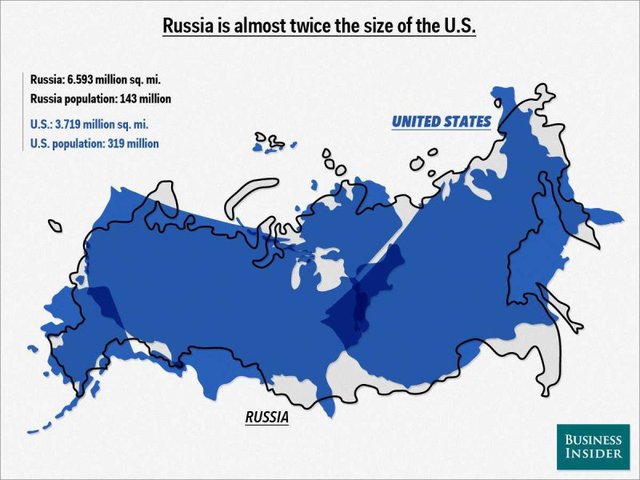
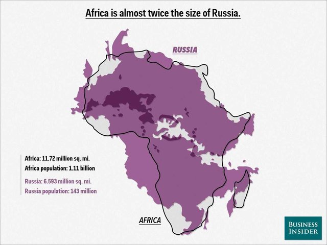
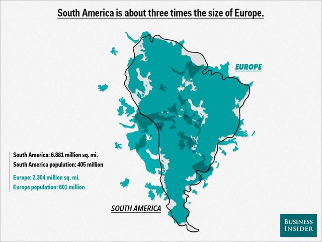
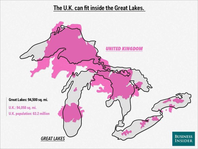
Inspired by a map illustrating Africa’s true size by German graphic designer Kai Krause, Mike Nudelman of Business Insider has created a series of map overlays that give some perspective on the sizes of countries around the world. For example, Russia is nearly twice the size of the United States, while Africa is almost twice the size of Russia. Head over to Business Insider to see more of the fascinating maps.
images via Business Insider