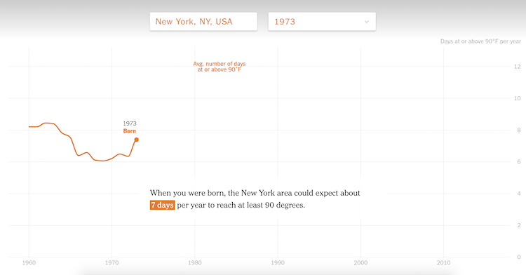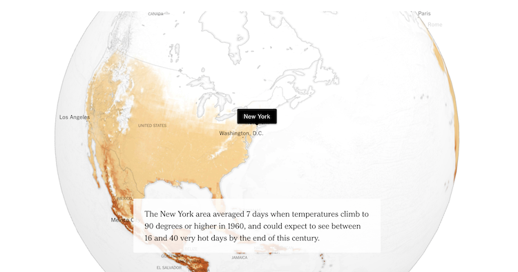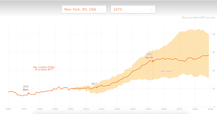
The New York Times has put together a fascinating interactive chart that reveals just how much the temperature has increased (by number of days) in your hometown since the year of your birth. Additionally, this map goes on to project how much the heat will increase from this day forward through a startling graph that appears to move ever upward.
As the world warms because of human-induced climate change, most of us can expect to see more days when temperatures hit 90 degrees Fahrenheit (32 degrees Celsius) or higher. See how your hometown has changed so far and how much hotter it may get.