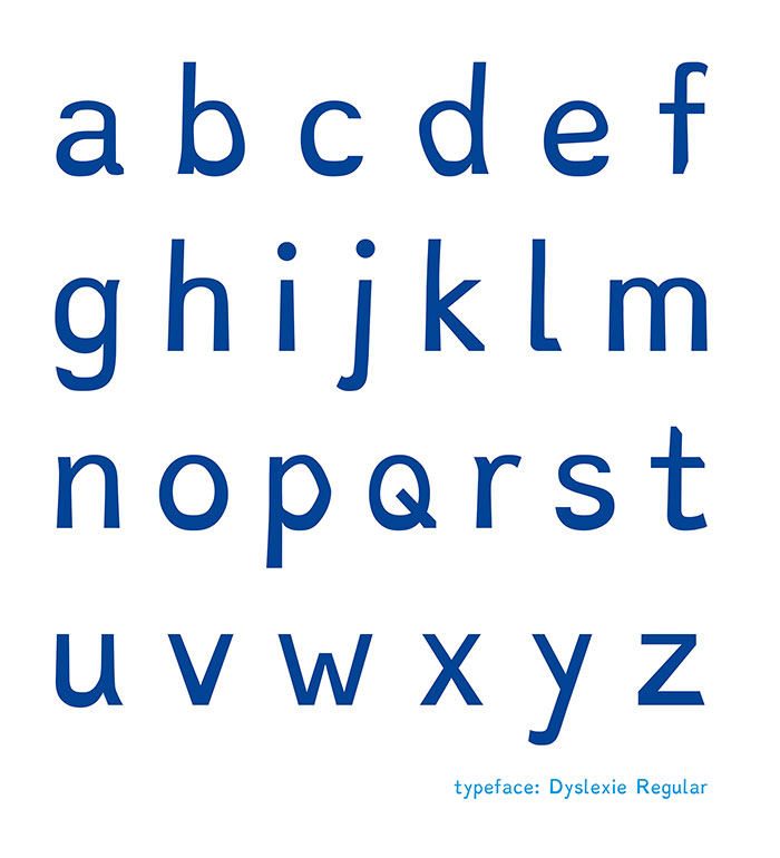
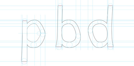
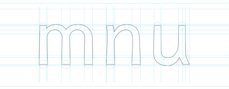
Dyslexie is a typeface specifically designed for people with dyslexia. Dutch designer (and dyslexic) Christian Boer created the typeface with subtle tweaks to the letterforms that increase their readability for people with dyslexia. As Boer explains, dyslexics tend to mirror and rotate letters as they read, which makes reading very difficult. Many common typefaces aggravate this problem by having very uniform letterforms–for instance “b” and “d” may appear as mirror images of one another. The characters in the Dyslexie typeface have a slight cursive slant and slightly varied vertical elements and openings to prevent similar letters from being confused. Heavier bases help visually anchor the letters so dyslexics are less likely to rotate them.
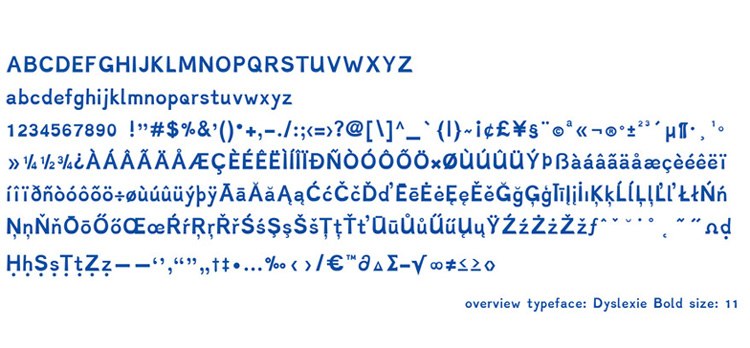
According to Boer, user feedback and several research studies indicate that Dyslexie does make reading easier for many people with dyslexia. Dyslexie is currently on display at the 2nd Istanbul Design Biennial through December 14, 2014. It is available online for a variety of systems and devices, and it is free for home use.
images via Christian Boer
via Dezeen