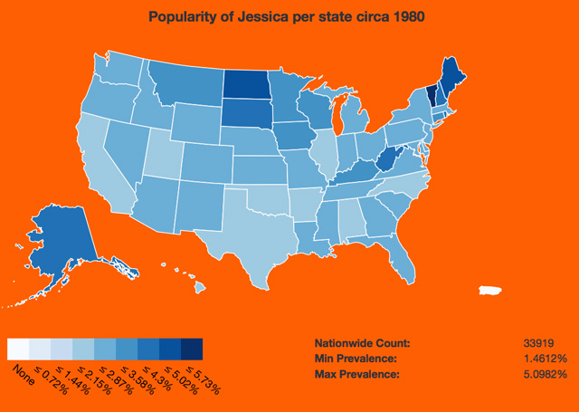
Brian Rowe has created a fascinating interactive map that visualizes the popularity of baby names in the United States from the early 1900s to the present. The map is based on census data and every name in the dataset can be visualized—about 29,000 in all. Rowe was inspired to create the interactive visualization after viewing Jezebel’s animated map of the popularity of baby names for girls. Jezebel has also created a map for boys’ names. Rowe talks about his visualization in this blog post.
image via Brian Rowe
via io9