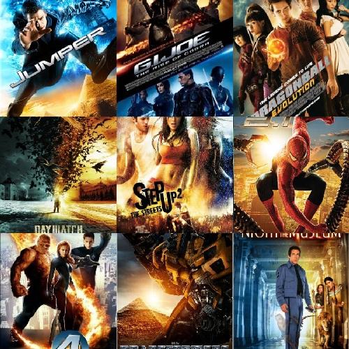
Priceonomics writer Roseann Cima has written a thorough breakdown explaining why so many contemporary movies lean so heavily on a blue (or teal) and orange color palette, including a truly elemental understanding of how we relate to colors.
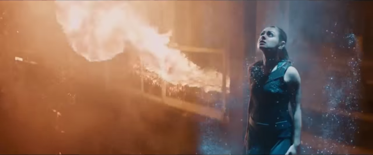
Unlike other pairs of complementary colors, fiery orange and cool blue are strongly associated with opposing concepts — fire and ice, earth and sky, land and sea, day and night, invested humanism vs. elegant indifference, good old fashioned explosions vs. futuristic science stuff. It’s a trope because it’s used on purpose, and it does something.
The effect has become especially prevalent in blockbusters over the past several years, including, perhaps most notably, the Transformers series, which actually served as a template for a color grade setting in an MIT research paper on the phenomenon.

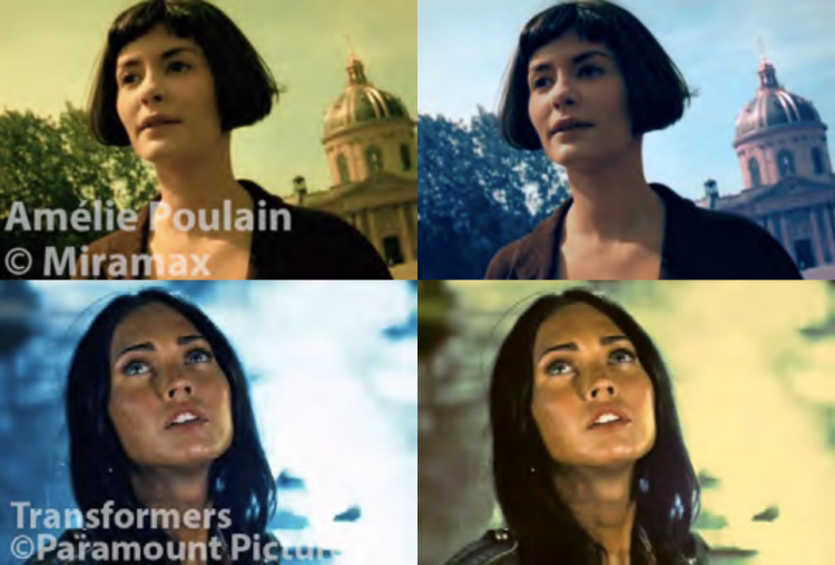
images via Priceonomics
via Priceonomics