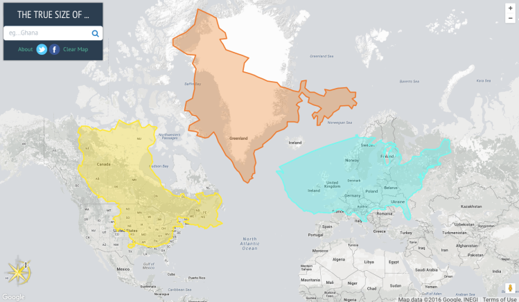
The True Size Of is an interactive map created by James Talmage and Damon Maneice that lets users accurately compare the actual size of countries in relation to each other. Users can add a country’s outline to the map, and as they move it around, the outline resizes itself to compensate for the Mercator projection which distorts the apparent size of countries in order to represent the round Earth as a two-dimensional image.
Every map projection introduces distortion, and each has its own set of problems. One of the most common criticisms of the Mercator map is that it exaggerates the size of countries nearer the poles (US, Russia, Europe), while downplaying the size of those near the equator (the African Continent). On the Mercator projection Greenland appears to be roughly the same size as Africa. In reality, Greenland is 0.8 million sq. miles and Africa is 11.6 million sq. miles, nearly 14 and a half times larger.
via Wired