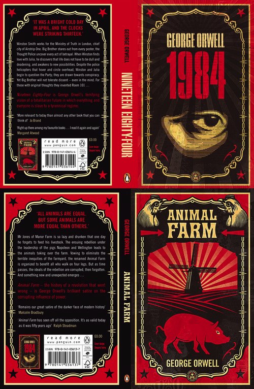
Shepard Fairey has designed some really cool covers for the Penguin Books re-issue of the George Orwell classic books “Nineteen Eighty-Four” and “Animal Farm”.
via Boing Boing
image via Penguin Books

Shepard Fairey has designed some really cool covers for the Penguin Books re-issue of the George Orwell classic books “Nineteen Eighty-Four” and “Animal Farm”.
via Boing Boing
image via Penguin Books