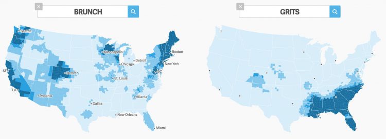
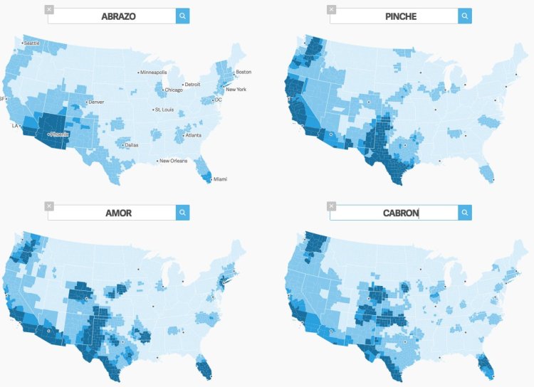
Quartz reporter and coder Nikhil Sonnad has created the “The Great American Word Mapper“, a very clever set of searchable, interactive maps of the United States that plot the top 100,000 words used on Twitter, categorizing them by subject and then by region. In tackling this enormous project, Sonnad employed data he gathered from trusted academic sources.
The data for these maps are drawn from billions of tweets collected by geographer Diansheng Guo in 2014. Jack Grieve, a forensic linguist at Aston University in the United Kingdom, along with Andrea Nini of the University of Manchester, identified the top 100,000 words used in these tweets and how often they are used in every county in the continental United States, based on location data from Twitter. Once Grieve and Nini identified these words and their locations, they used hot-spot testing, a common technique in spatial analysis. This is the “regional smoothing” setting you see above. This technique uncovers geographic trends in data by clustering together nearby areas with similar results.
Some misc word maps made with the word mapper https://t.co/R2wCfnsegx pic.twitter.com/6jiDdJN5QL
— Nikhil Sonnad (@nkl) December 15, 2016
images by Nikhil Sonnad