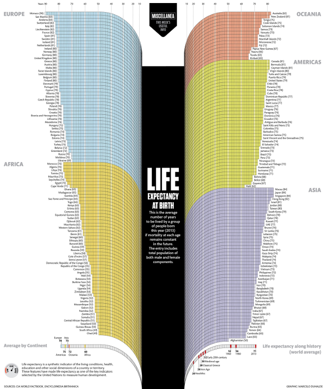
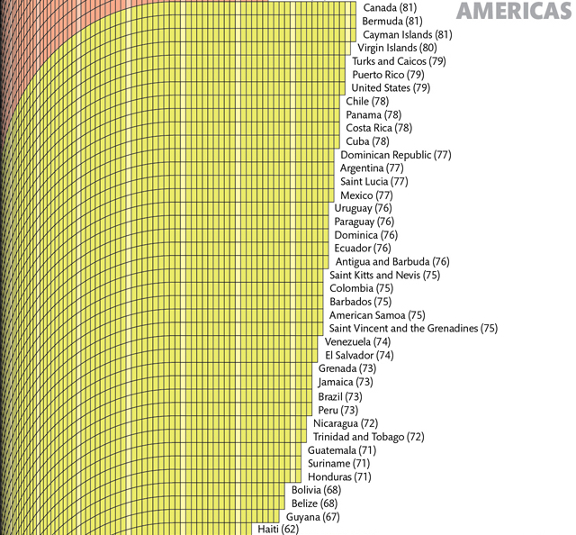
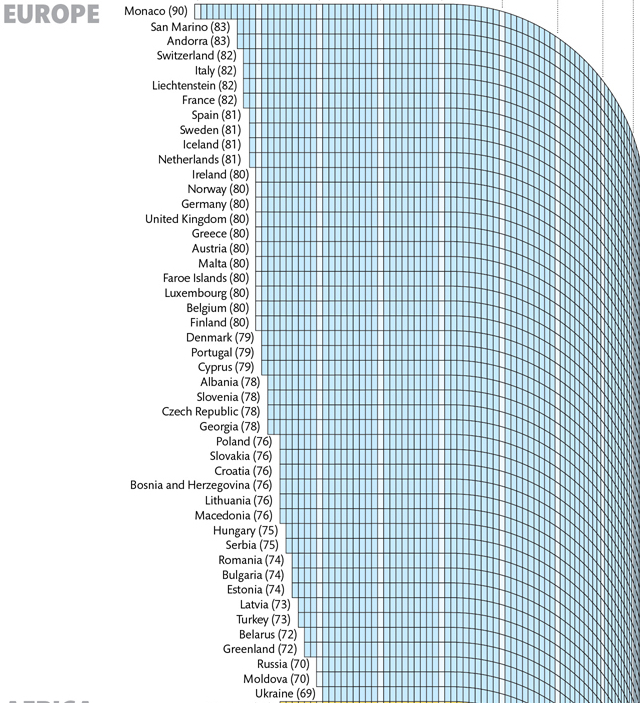
Visual journalist Marcelo Duhalde has created a data visualization that charts life expectancies around the world. According to the chart, a person born in 2013 in Monaco has the highest expected life span — an average of 90 years — while Chad has the worst with an average of just under 50 years. A larger version of the informative chart is available to explore at Visualizing.
images via Visualizing
via The Atlantic